If it all goes to plan, this blog will jump around my timeline, making connections, highlighting recurring themes and inevitably at some point look at just how much financial services work I have done in my career.
However, as this is the first entry it makes sense to start at the beginning.
And this is as much of the beginning as I can find.
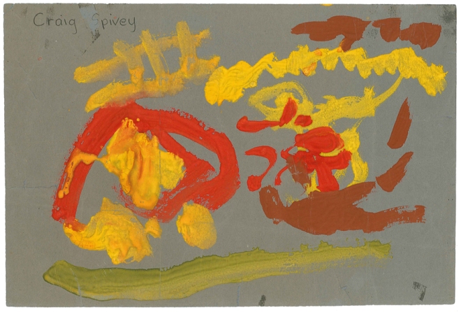
This little thing reappeared in my life a couple of years ago when my grandma died. I was previously unaware of its existence, but she’d kept it for some 3o-odd years and is now the earliest evidence of ‘my art’ in existence.
It’s a fire engine.
But you don’t need me to tell you that, right? The ladder gives it away.
That and all the fire.
To be honest, painting with a brush was never my medium. Too messy and it never really went where I wanted it to. When I took my O Level options at 13 I dropped art but did tech drawing and, by the time I was into my BTEC OND in Art and Design, I’d swapped the poster paint and sugar paper for Indian ink and cs10 board.
So if the fire engine was among the first marks I ever made on paper, the 1989 Scunthorpe calendar was certainly the first thing I ever got printed on it.
In those days it was all very analog, no inkjets or laser printers. So for a kid like me to get some of his work professionally produced on a proper printing press was a massive thrill – up there with cutting a single and getting it played on John Peel.
Our course at North Lindsey College of Technology was approached by the local Industrial Development Enterprise Agency (IDEA) who wanted a calendar that would showcase our ‘industrial garden town’ and encourage businesses worldwide to locate their factories on all the bits of land left after the closure of big chunks of the steelworks in the early 80s.
I have vague recollection of a representative coming in to brief us, along with promises of fame and fortune for the winning designer. It was like getting a sneak preview of real working life, which was something the course leaders were always good at setting up.
I threw myself into it wholeheartedly.
And after my fab and inspiring tutor, Carole Van Hoffelen, steered me away from one of my earlier ideas – aerial pics of an industrial wasteland with an overlaid cross hair and the line ‘Set Your Sights on Scunthorpe’ (I wish I was joking) – I settled on something that ultimately proved to be a bit more appropriate and much less luftwaffe-ish.
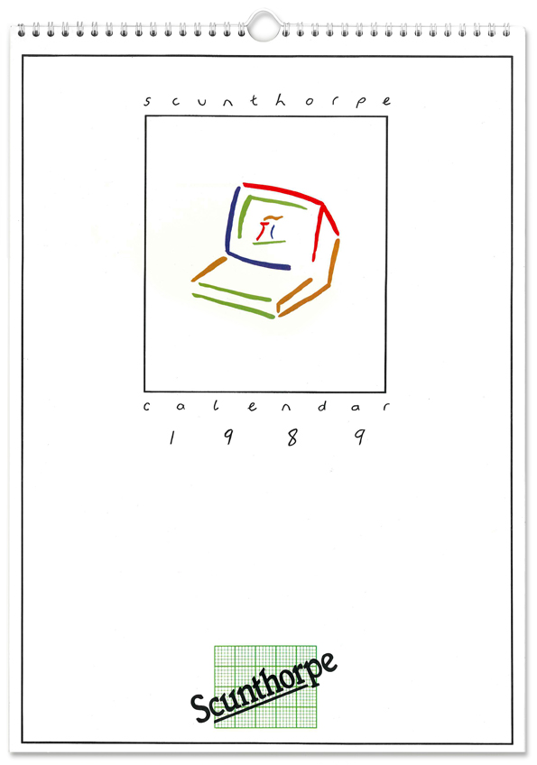
That brush stroke abstraction thing was everywhere in the late eighties. And this illustration style is clearly influenced by some of the logos that were around at the time. It looks a bit like the Glasgow Garden Festival logo, as well as that year’s Eurovision logo…
…but what it didn’t look like the image anyone had in their head when they thought of ‘Scunthorpe’.
Conceptually it talked about things like ‘prosperity’, the ‘future’ and, um, ‘golf courses’. The painter’s palette on the last page was supposed to be a self-referential link that tied the whole idea together, while heralding a bright and colourful tomorrow for the town.
I’m sure that wasn’t lost on the councillors on the judging panel.
Though maybe it was the golf courses that won it for me.
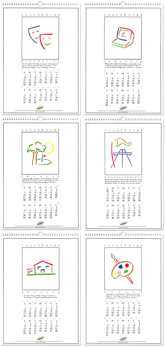
I created all the illustrations and the headings in black ink and specified the colours on old school overlays, while my mate Sean provided the handwriting for the little pieces of text. The dates were set by the printer along with that incredible Scunthorpe graph paper logo and contact details.
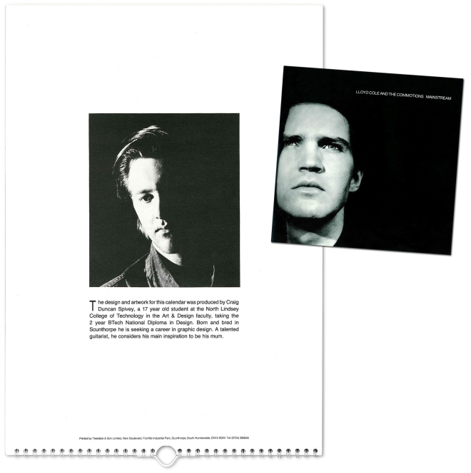
I was granted a ‘small’ picture and a byline and my then girlfriend, Janine, and I put as much effort into that as I did creating the calendar. We went all out to the recreate the style of the cover art of the Lloyd Cole and the Commotions Mainstream album, although Lloyd wasn’t a teenager whose skin looked like the surface of the moon when lit so harshly from the side.
Here’s Lloyd looking all cool and tortured and me looking like a miserable, pretentious prick.
As our BTEC course was relatively new, the powers that were went into PR overdrive and I appeared in various local publications, clutching the calendar, striking a balance of cocky and awkward like only a 17 year old can.
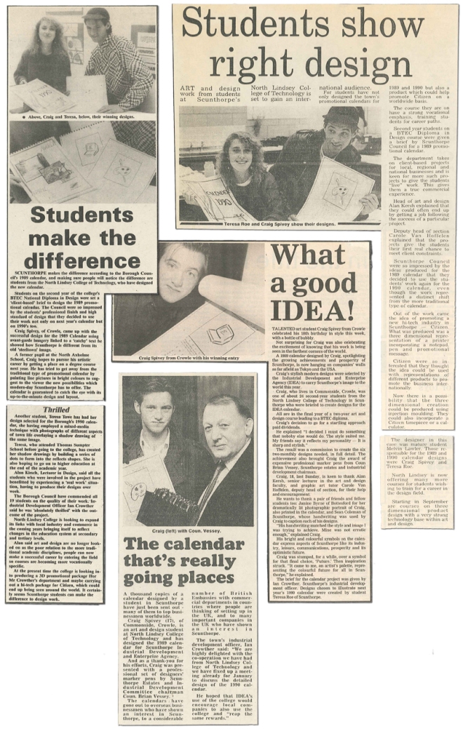
I find the calendar all very quaint and naïve now. If the style doesn’t date it, the big slab of a computer monitor does. The brush work is hardly Alan Fletcher and spacing out the three character word ‘May’ over about 150mm is something I couldn’t see myself doing these days, though it does represent my first real step into this industry.
I loved my BTEC course, it was a blissful time and I got to hang out with people who, all these years later, I still class among the most naturally gifted I have ever worked alongside. Janine’s now an Art Director on the Nike account for W+K in Portland, Oregon but Sean and I lost touch some years back. A bit of googling shows him to be doing some sweet stuff up in Sheffield at his own agency – in the final analysis, while I won a calendar design competition, he was the one that actually cut a single and got it played on John Peel.
But I digress.
The brush stroke thing reappeared some years later in 1999 when I was working at Parenthesis in Coventry.
We were asked to design a logo for The Arena for a the new SkyDome complex that was slated to be built in the city. I remember putting a presentation together that included two logos that captured the energy and spirit of people enjoying live entertainment, and a third option that nodded to the middle curve of the existing SkyDome logo, as well as The Arena’s arched roof and some of the architectural features on the plans we’d been given.
They went with the latter.
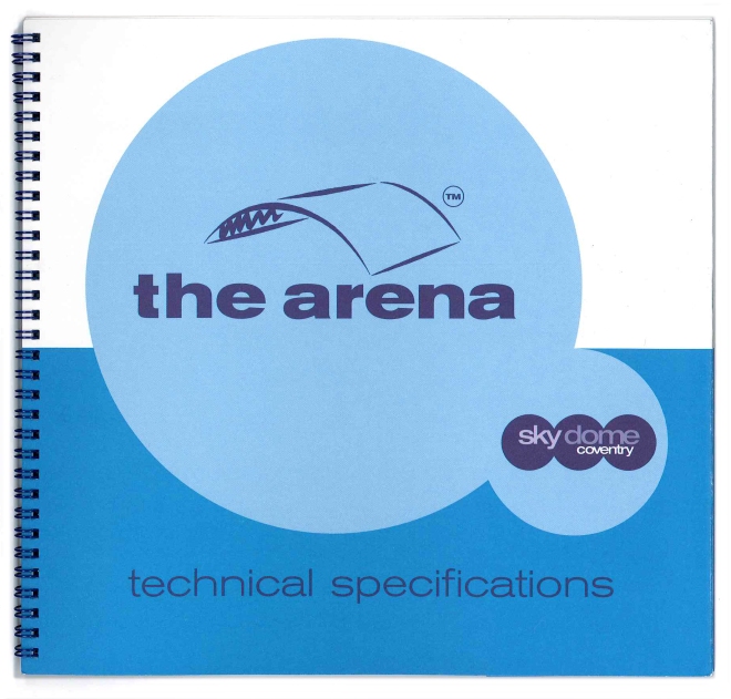
The idea was around a ‘building with spirit’. A physical structure whose purpose as a live music and sports venue gave it an energy and attitude – hence the dynamic brush stroke execution. In this instance I briefed a proper illustrator to paint the final image, though I forget who. It’s neater and sharper than any of my attempts were anyway.
What wasn’t clear at the outset was just how much the SkyDome brand would end up dominating The Arena, and, as the project progressed, they began to feel more and more at odds with each other. The worst expression of this is probably the exterior signage, which I remember having no control over. We produced some nice bits of print collateral for them as well as supplying them the digital assets and then this ill-considered monstrosity just appeared in glorious light up 3D chunky plastic.

Still, I suppose that the fact it is still there some 13 years later means it has done a good job for them.
I don’t think it ever took off as the big music venue it wanted to be (and now Coventry has the Ricoh Arena) but it has enjoyed life as an ice rink and occasional boxing and wrestling venue. The Arena branding has certainly outlived the two iterations of its super-club neighbours on the other side of the SkyDome complex anyway.
Though I still think how much nicer that sign could have been when go past it.
Bringing things up-to-date is more recent piece of work with a painterly theme.
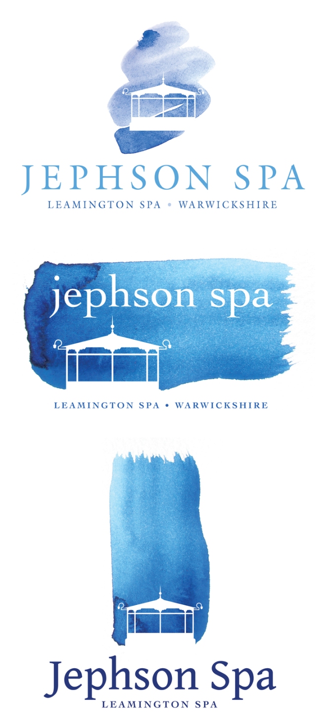
So recent it hasn’t really happened yet.
This is a sneaky peek at some notional logos aimed at getting the ball rolling on a new local enterprise. Hydrotherapy is very much at the heart of this project and the location plays a huge role too. The Japanese feel is no accident either. A job like this really benefits from the flow and serenity of watercolour textures that instantly get the right vibe over to potential investors and partners.
It will be a long project to bring to fruition but I really hope it happens, as it will be great to do more work on.
In the meantime, I have plenty to be getting on with.
Will be back soon, if only to prove I can do logos in other colours.
Cheers
Craig
I love the calendar – pure 1980s design…and hair!
Think I still have your calender somewhere Craig x